Trusted by
Do more with your POS
Our products can help you streamline your workflows and reclaim time for your staff to do high value work

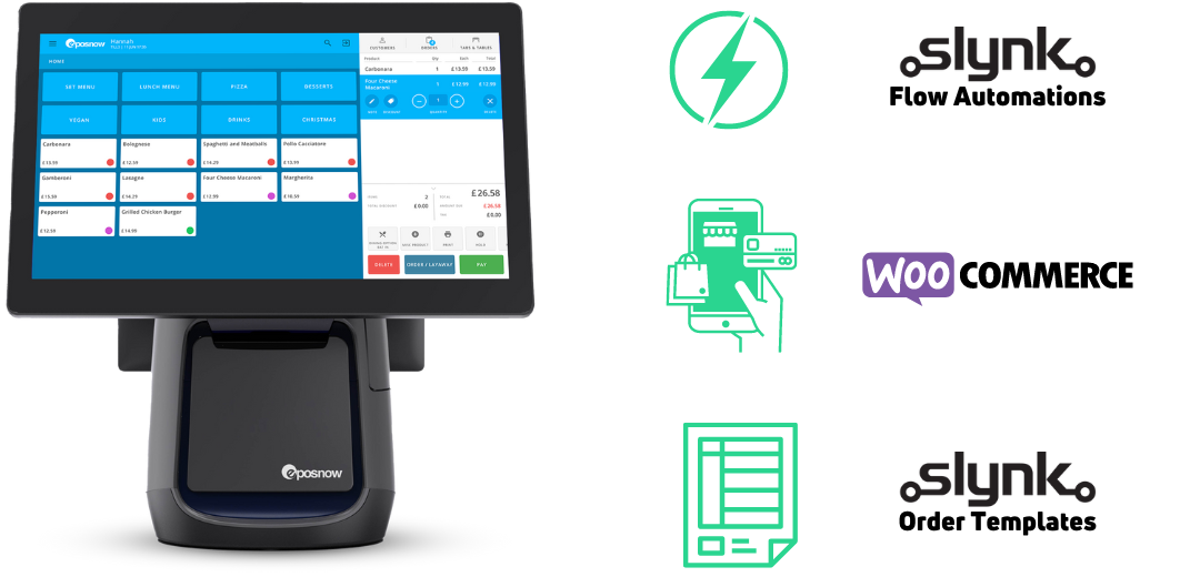
integration
EposNow + WooCommerce
Sync products, stock, orders and customers between EposNow and WooCommerce

Automation
Flow
Create flows to run pre-defined tasks on EposNow on a schedule reliably and automatically.

Customisation
EposNow Order Templates
Create on-brand invoices, quotes, delivery notes, packing slips, food labels, receipts and more